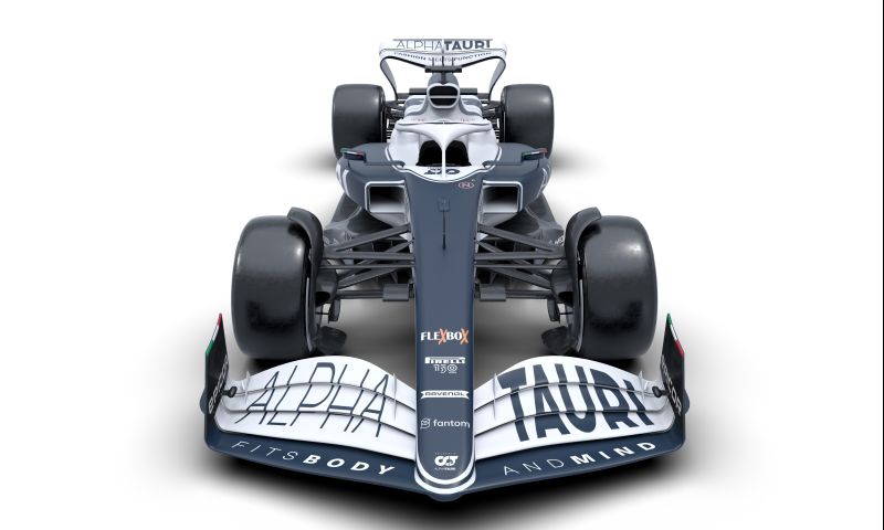
2022 AlphaTauri livery compared to 2021: Here's what stands out the most
Red Bull Content Pool
F1 News

- GPblog.com
On Monday morning, AlphaTauri presented the new car with which Pierre Gasly and Yuki Tsunoda will compete against the rest of the grid in 2022. In terms of colours, the car looks very similar to last season's car, but there are still some major differences.
2021 vs. 2022
The AlphaTauri team has chosen a colour scheme of blue and white this year. The new livery contains slightly more blue than last season, mainly when the car is viewed from the side. The Honda logo on the rear wing has been replaced with the AlphaTauri logo, and it is now also prominent on the side.
The front wing is coloured mostly white, whereas in 2021 it was mostly blue. The same goes for the rear wing. On the side of the front wing you can see a new sponsor of the team, called Flex Box. Also notable are the black coloured wheel rims of the AlphaTauri, which were famously white last season.
Another difference between the liveries is the partition of the driver's cockpit. This is now coloured white together with the halo and is therefore more noticeable.
2021 vs. 2022, @AlphaTauriF1 style #F1 pic.twitter.com/mnmgBHNcgg
— Formula 1 (@F1) February 14, 2022