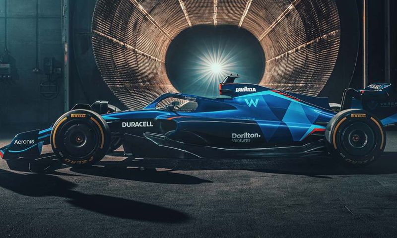
New Williams livery compared to 2021: Here's what stands out the most
Williams
F1 News

- GPblog.com
Williams presented the livery of the new Williams car on Tuesday afternoon with which Nicholas Latifi and Alexander Albon will compete. There are a few similarities to discover, but there are certainly some differences as well.
2021 versus 2022
The team still uses some of the same colors, but some colors have also been added and taken away. The 2021 livery was blue with white and orange and black accents, but the 2022 livery is blue with red accents. Last year the front wing was a combination of white and blue, but the new design consists of a dark blue color with light blue and red accents on the bottom.
The font on the rear wing has changed and, in addition, it no longer says just Williams, but Williams Racing. Furthermore, the Lavazza logo is still in the same place on the side of the car, but the logos of Dorilton Capital and the new sponsor Duracell are now also clearly visible. The Williams logo on the side of the car also has a different font and is in a different place. The logo was white in 2021 and therefore easy to see, but it is light blue now and works well with the other blue colours.
View this post on Instagram